·
1 分钟阅读时长
·
499
字
·
-阅读
-评论
title: “margin-top的百分比设置” tags:
- CSS slug: 7710da21 date: 2021-02-18 20:44:28 summary: “本文是作者对margin-top的百分比设置的介绍,包括margin-top的百分比设置的优势、实现细节、相关资料等,这些步骤可以帮助作者提高margin-top的百分比设置的效率。”
The values of margin-top, margin-bottom, padding-top, and padding-bottom support percentages. Those percentages are calculated against the container (i.e., the parent element)’s width, not its height (refer to the containing block’s logical width). This detail is easy to overlook, so here’s a quick note.
Example
   .margin-container {
        background: #214177;
        color: #fff;
        width: 600px;
        height: 500px;
      }
      .margin-child {
        width: 200px;
        height: 100px;
        margin-top: 10%;
        background-color: #82a6cb;
      }
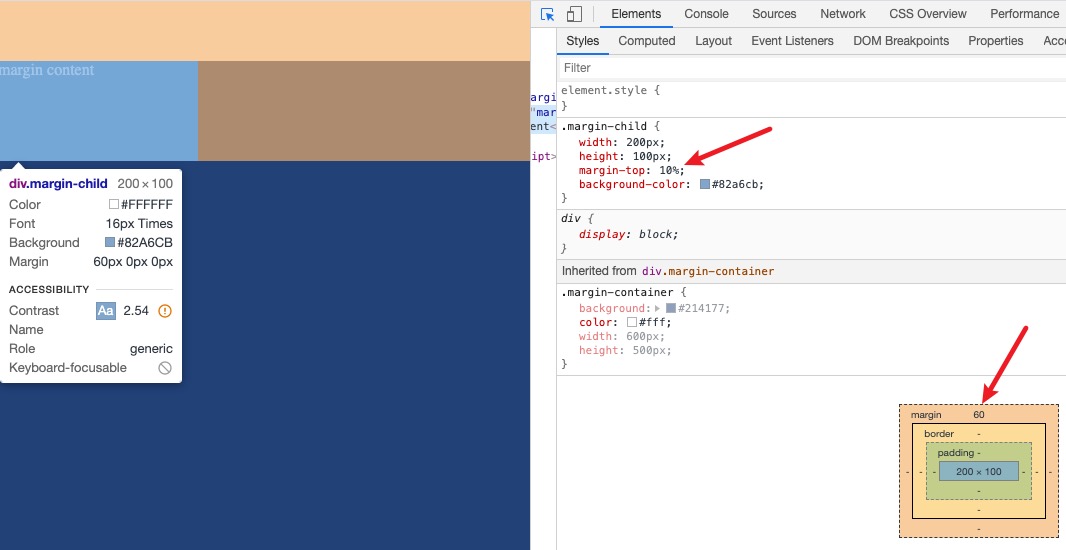
As shown, the child’s margin-top is 60px, i.e., 600 × 10%. padding-top behaves similarly.
Notes
- padding,margin支持百分比,而border是不支持百分比的
- 这里是容器宽度即父元素宽度而非元素自身的宽度
Why This Design
Beyond remembering this niche detail, it’s worth understanding why it’s designed this way. I checked some references [#Oh Hey, Padding Percentage is Based on the Parent Element’s Width], and the explanation is roughly as follows:
- If percentages were based on the container’s height, we’d hit a circular dependency: the container’s height depends on the heights and margins of its children, and if those margins depend on the container’s height, it’s unsolvable. Browser width and height behave differently: width is finite and determinable, while height can be effectively unbounded.
- Basing it on the element itself would violate the broader design consistency. For example, font-size percentages are based on the parent element’s font size.
Final Thoughts
That’s my current understanding — corrections are welcome.

